About the project
The IT product showcase is a B2B platform where sales managers match IT solutions to a customer’s needs, assemble them into a proposal and share it. It has several types of users: the seller putting a proposal together, the prospective customer, and the product owner who publishes their own product page.
My role
The product was already live, but people were reluctant to use it, and it wasn’t clear exactly where the journey broke down. I ran the research, pulled the findings into a prioritized backlog and designed the key flows: search and catalog filtering, the product page, building the bundle. Separately, I worked out a concept for an AI assistant that finds the right products. The product had one designer: the lead came in as a consultant, the decisions stayed with me.
How I looked for problems
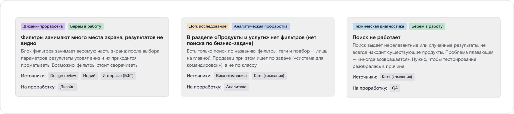
I broke the product into layers and walked through it as different users: a design review against the spec, interviews with managers built on real scenarios, usability tests, and group sessions with the stakeholders and the contractor. Every finding got a card with its source and the team that owns it, and I scored each one by user impact. We took on the ones that broke core tasks first.
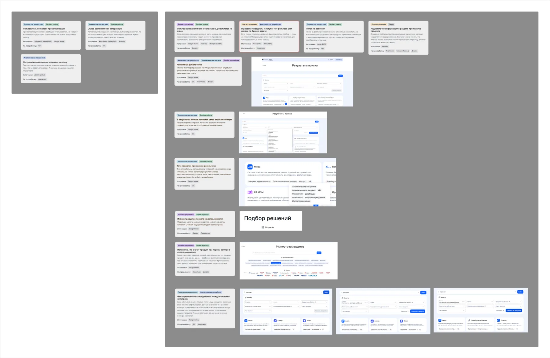
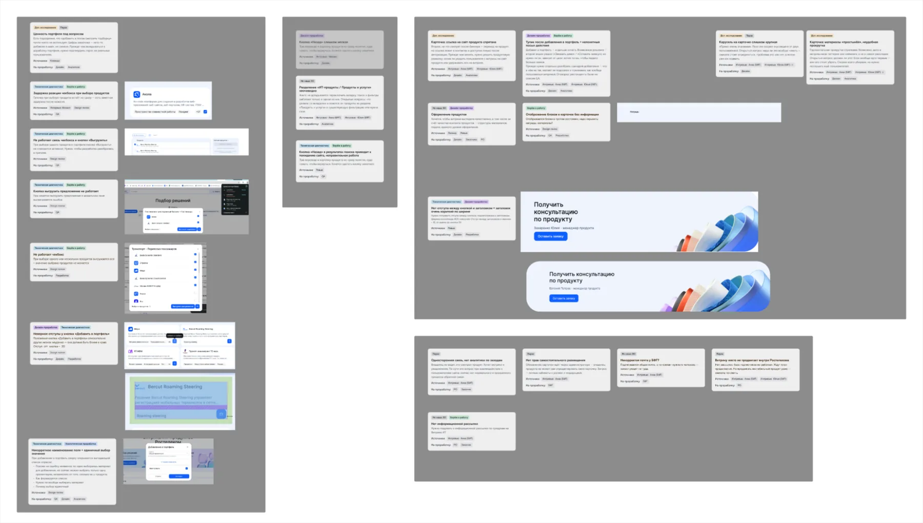
Findings by area: sign-in, bundle, product page, navigation
Each finding has a screenshot and a tag for its owning team
Search and filters
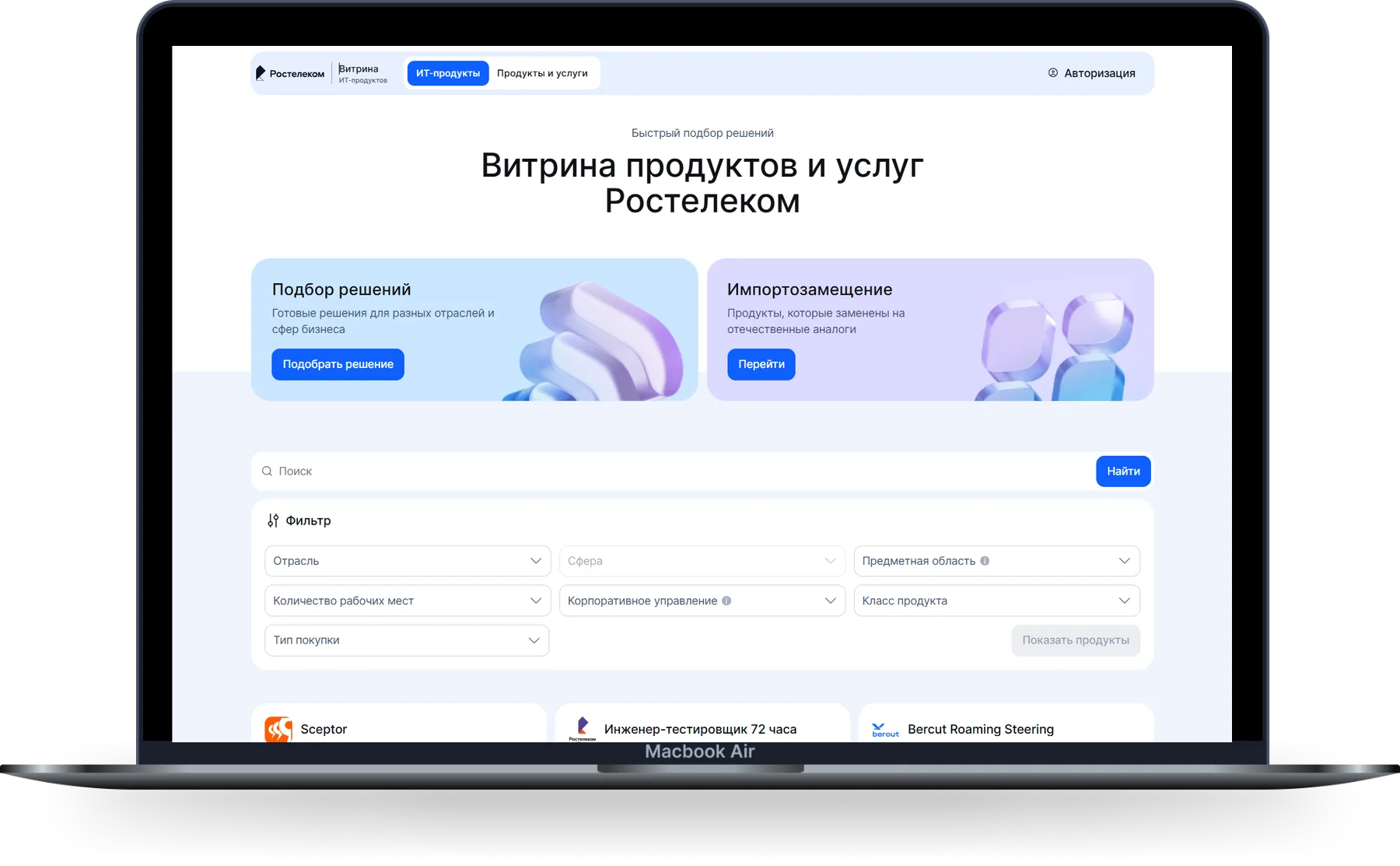
The main finding: hardly anyone searches with the filters. If people know the product, they type its name; if they don’t, they describe the task in their own words. And yet a block of seven filters took up half the screen and hid the catalog.
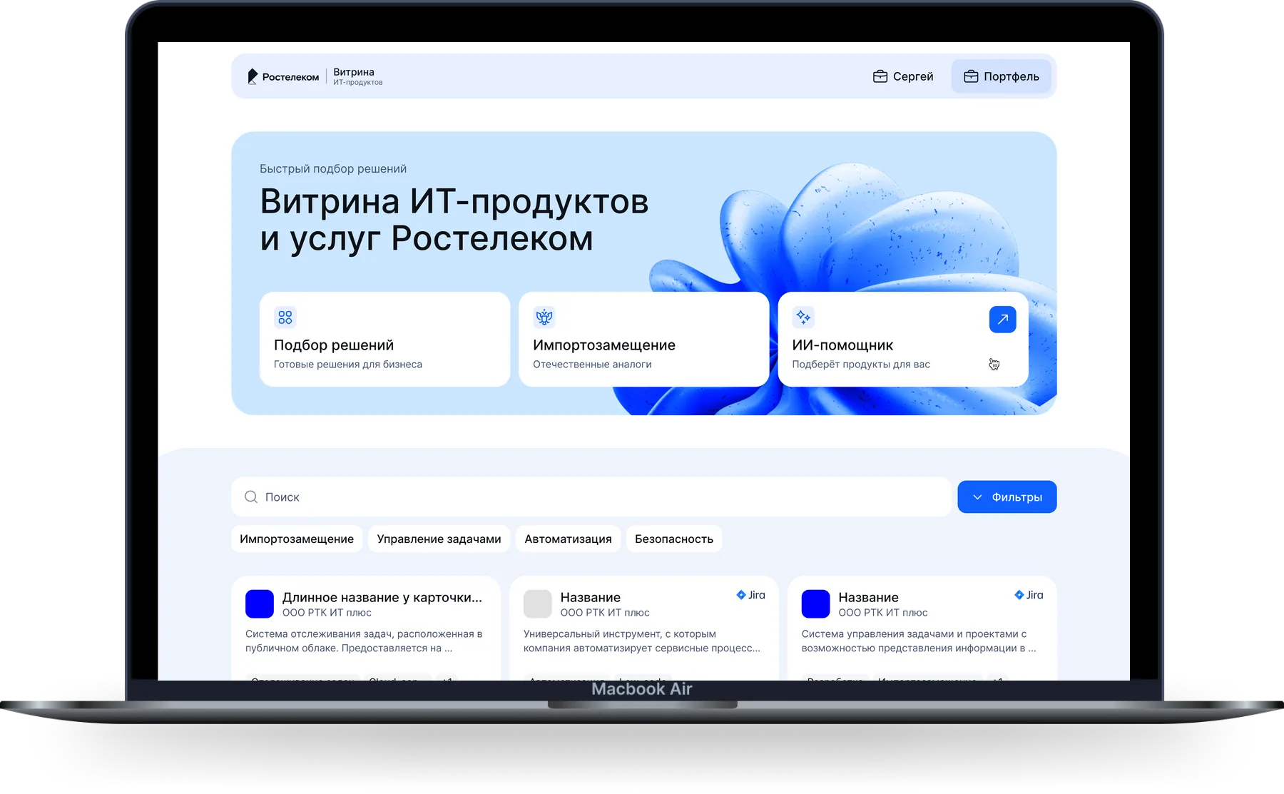
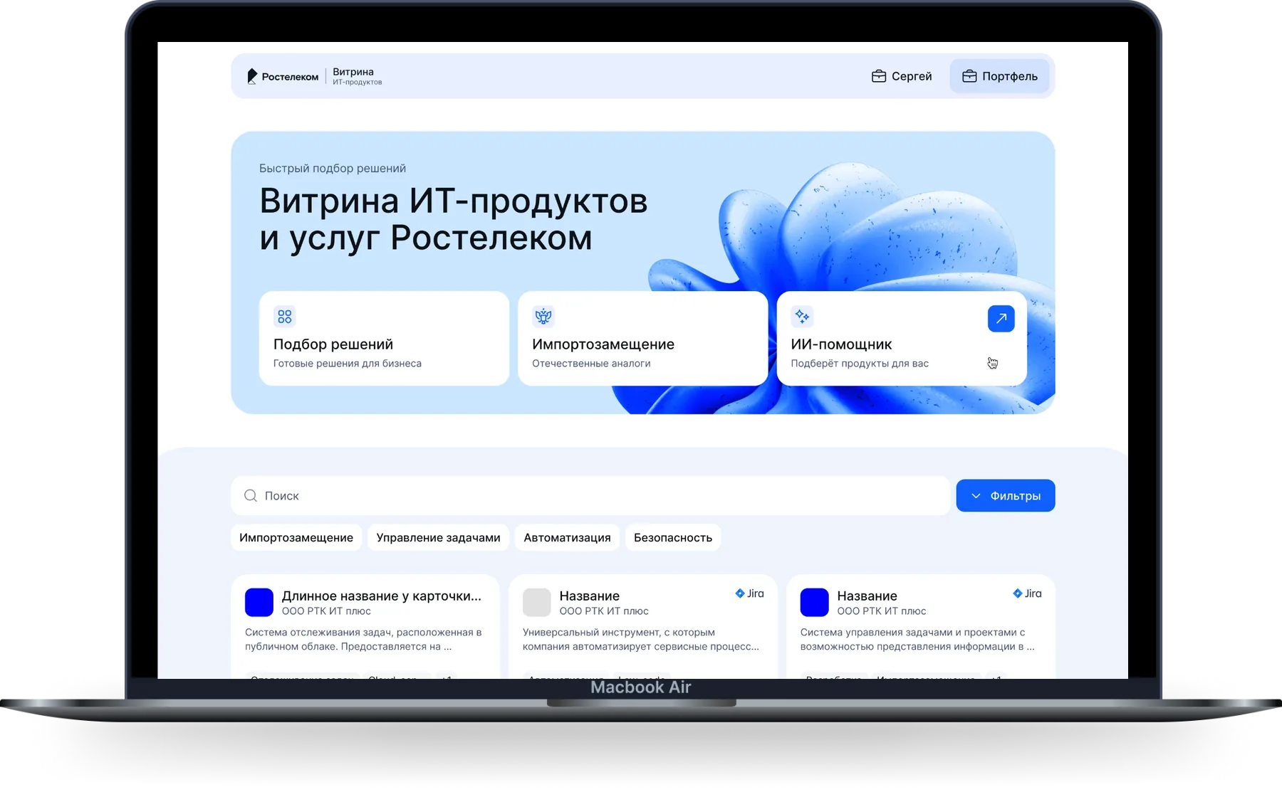
I collapsed the filters behind a button and kept two levels above the catalog: quick-filter chips for common categories in one click, and the full set behind the button for fine-tuning. Search and the catalog moved up, and a third entry point appeared alongside the other two: the AI assistant. Three ways in, for three different needs.
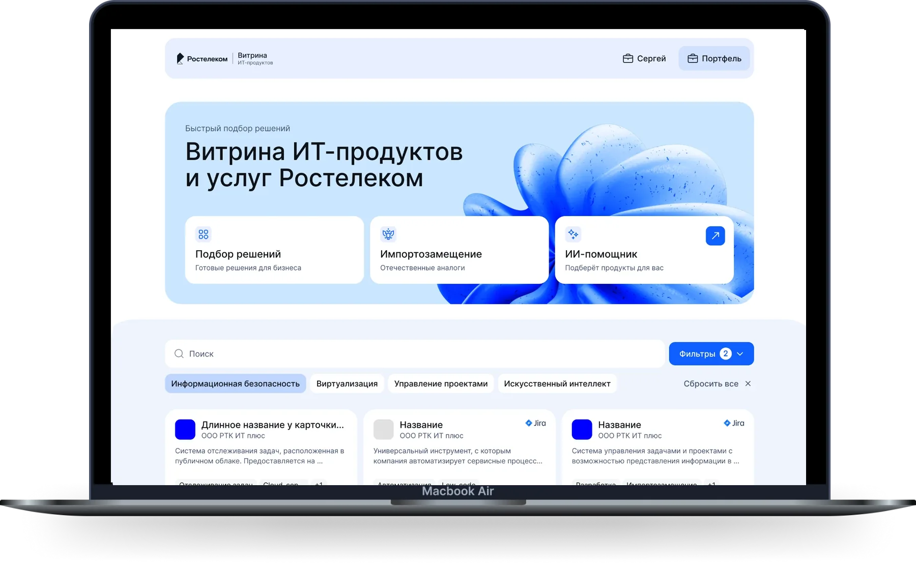
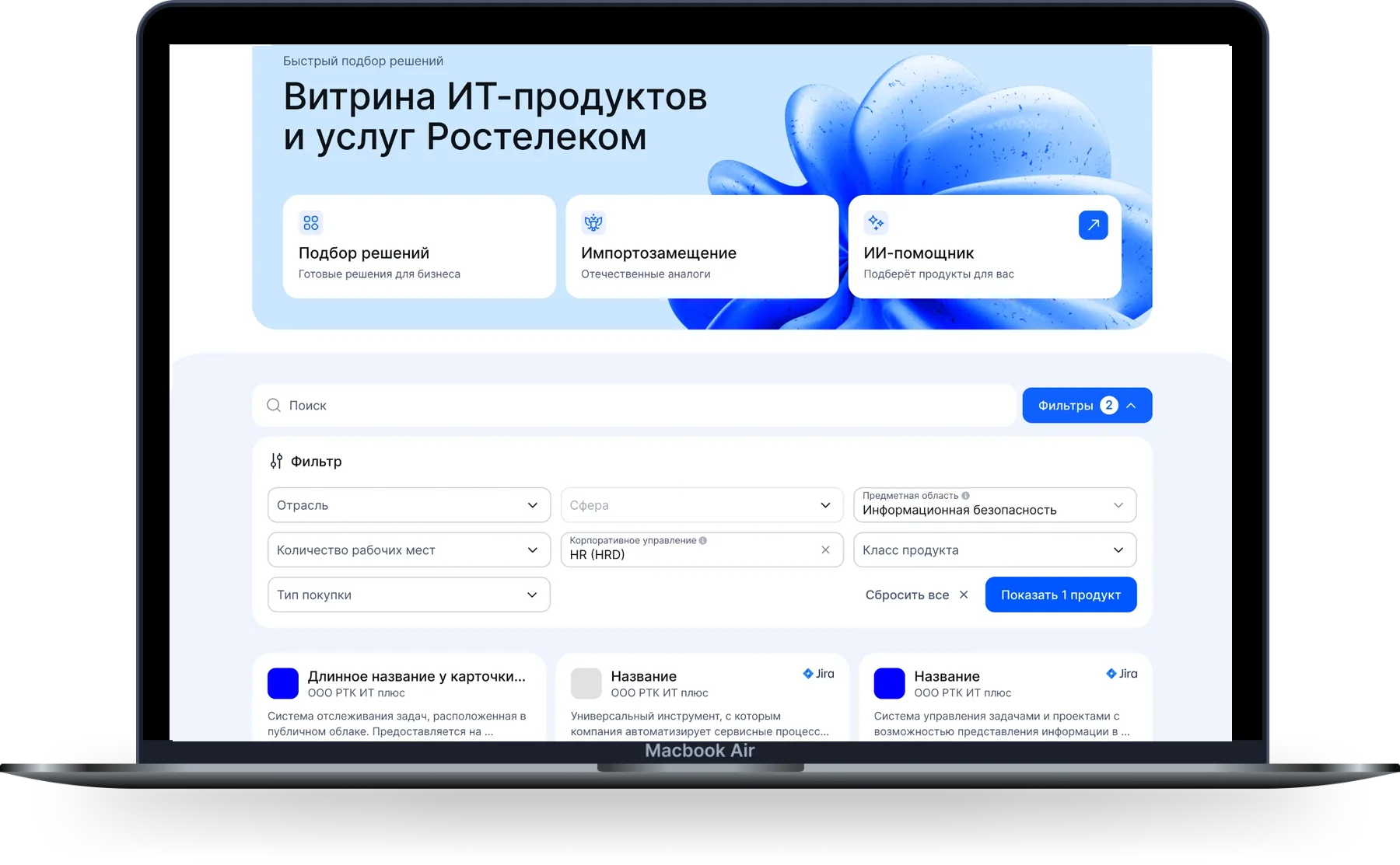
I reworked the top of the page separately. The old version had a section toggle up there that nobody noticed, so people never found half the products. I removed it and rebuilt the hero: the three entry points now sit in a single row, and search and the catalog moved further up.
AI assistant
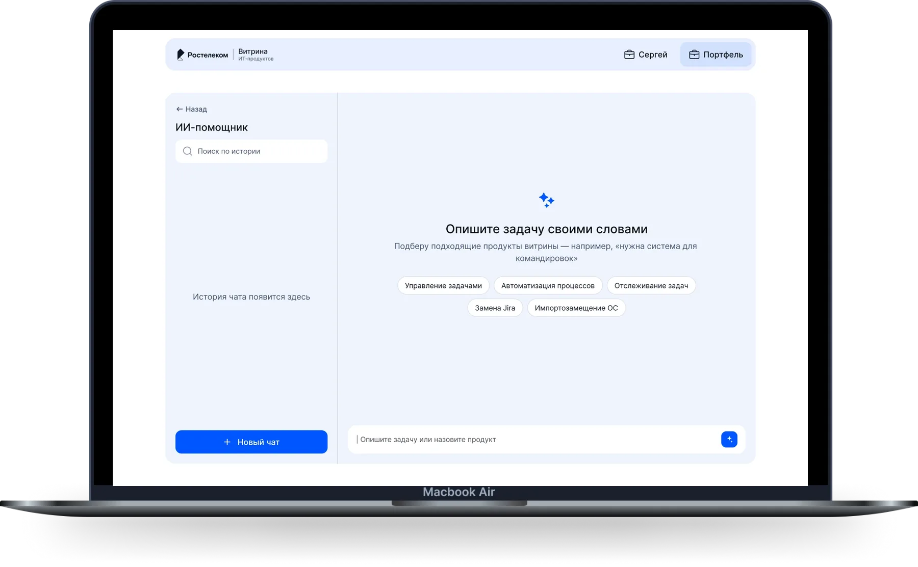
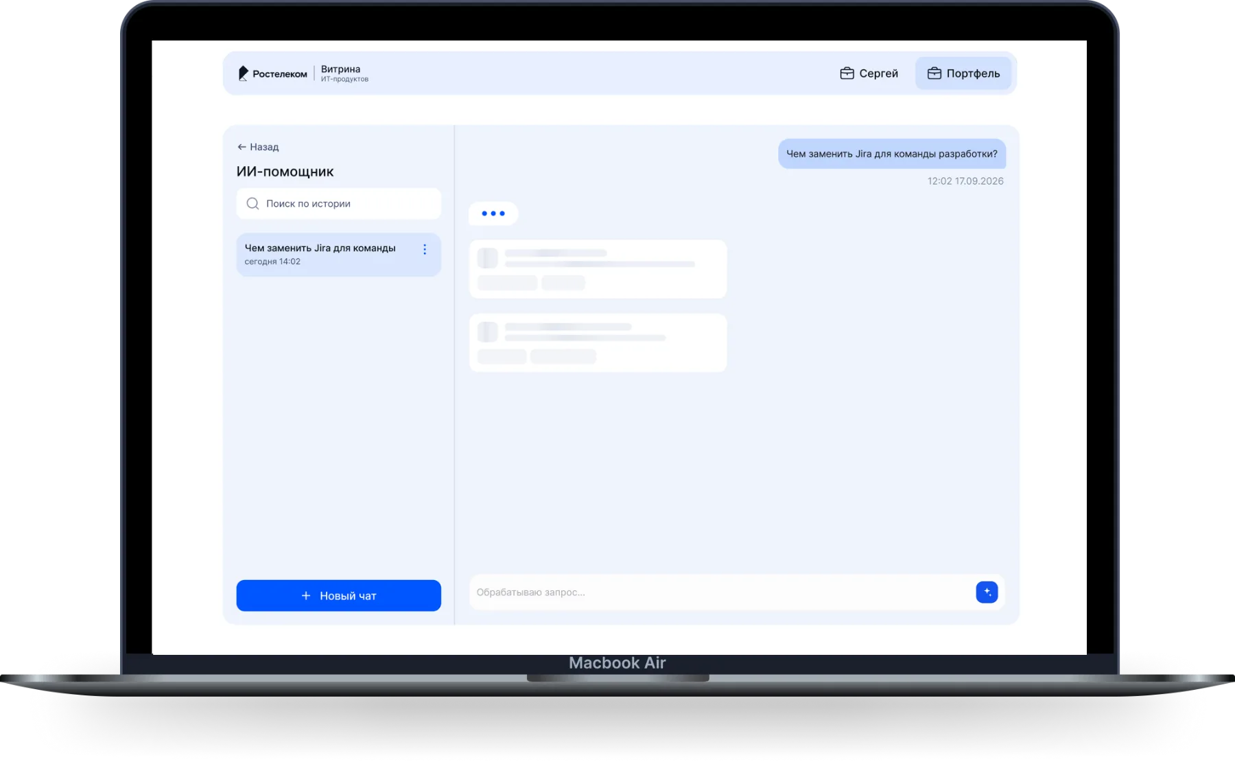
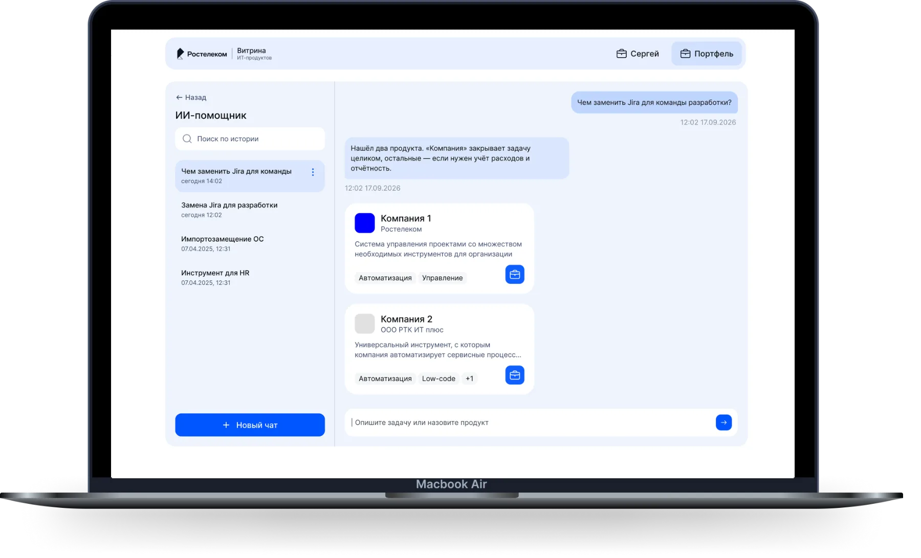
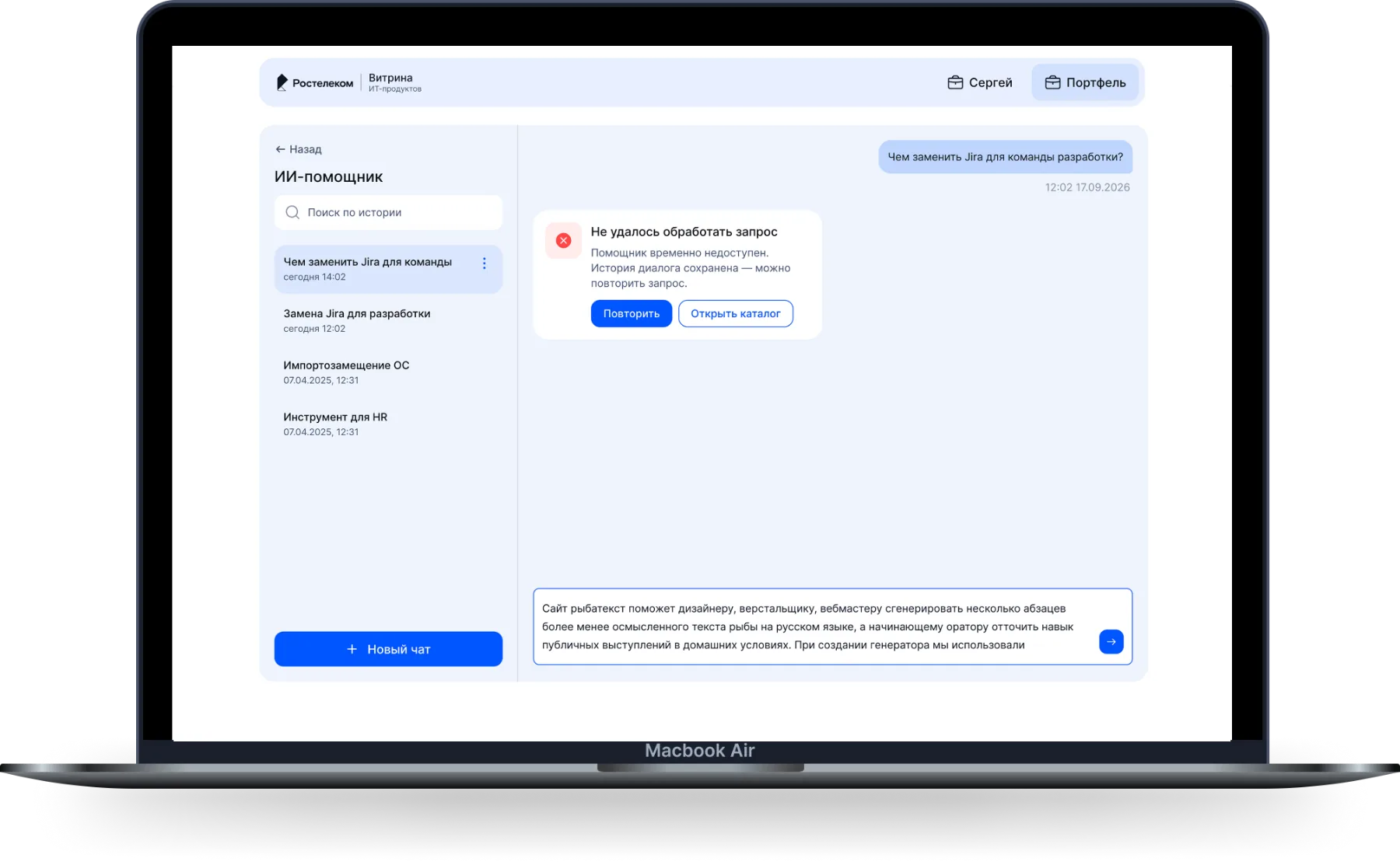
The AI assistant covers the third need: the user doesn’t know the product’s name and describes the task in plain language. They type “what can replace Jira for a development team”, and the assistant matches products from the showcase catalog and shows them as cards in its reply. Each card carries a link into the catalog and an “Add to bundle” button.
It comes in two parts: a lightweight entry panel for asking without leaving the page, and a separate chat page that keeps past conversations. A quick question in passing and careful matching with history behind it are different modes, so I kept them apart.
How it ended
The findings went into a prioritized table and a set of cards in Figma: they show what breaks core tasks, who owns it and where the finding came from. On top of them I redesigned the key flows— the top of the page, search and filters, the product page and working with the bundle.
By the time I left, every screen had gone into development, the AI assistant along with its spec for an entry panel and a chat with RAG search over the catalog. The finding backlog was handed over as it stood to the designer who picked the product up.